
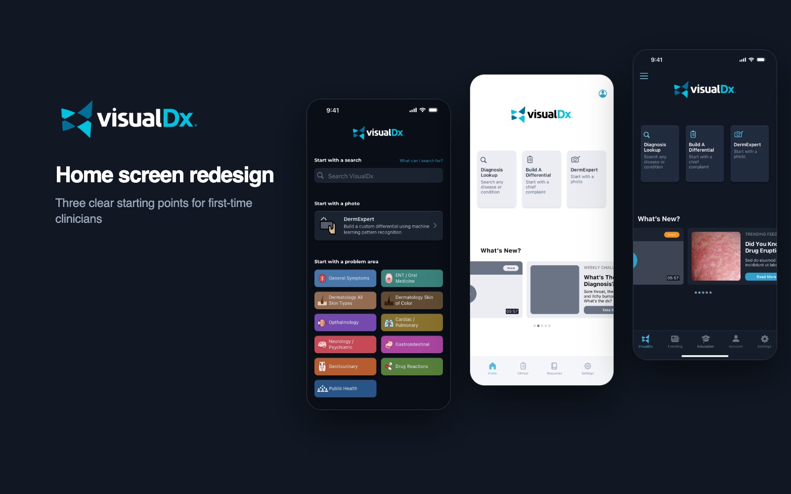
- The problem
- The home screen offered every path at once, so first-time users didn’t know where to start.
- What I did
- Designed two concepts with the Principal Design Engineer, then built and ran an unmoderated A/B study with first-time users.
- Where it landed
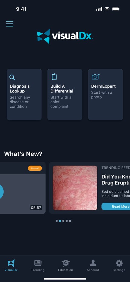
- Concept B shipped: three equal cards for the app’s core tools, with Concept A’s calmer spacing.
The questions that set the brief
- How do we get new users to value faster?
- What actually matters on the first visit?
- How do we show the high-value tools without overwhelming people?
Built for super users
VisualDx helps clinicians diagnose, especially visual conditions like skin disease, with a huge medical image library and tools for building a differential. The app had grown up around its founder, a dermatologist, and our Principal Design Engineer put it plainly: it was like a pilot’s console, built for super users.
Usage told the same story. Search was the most used feature across every kind of user, from subscribers to people on a trial. The other tools, the differential builder and DermExpert, the photo-based AI tool, were used far less or missed entirely.
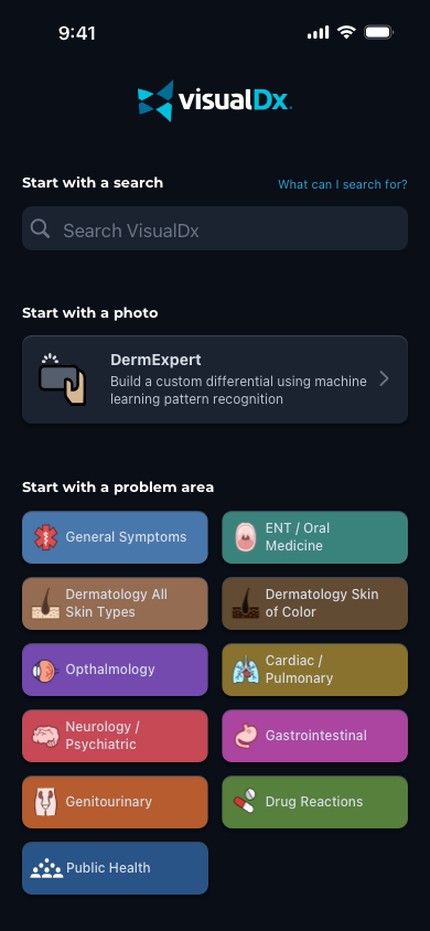
- No hierarchy. Search, photo upload and a grid of eleven problem areas all competed for the first tap.
- Too much at once. The problem-area grid was thorough, and overwhelming for someone new.
- No clear path. Nothing said where to begin, so new users hesitated or wandered.
Two concepts
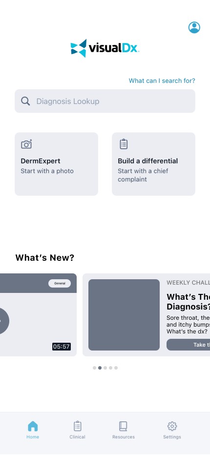
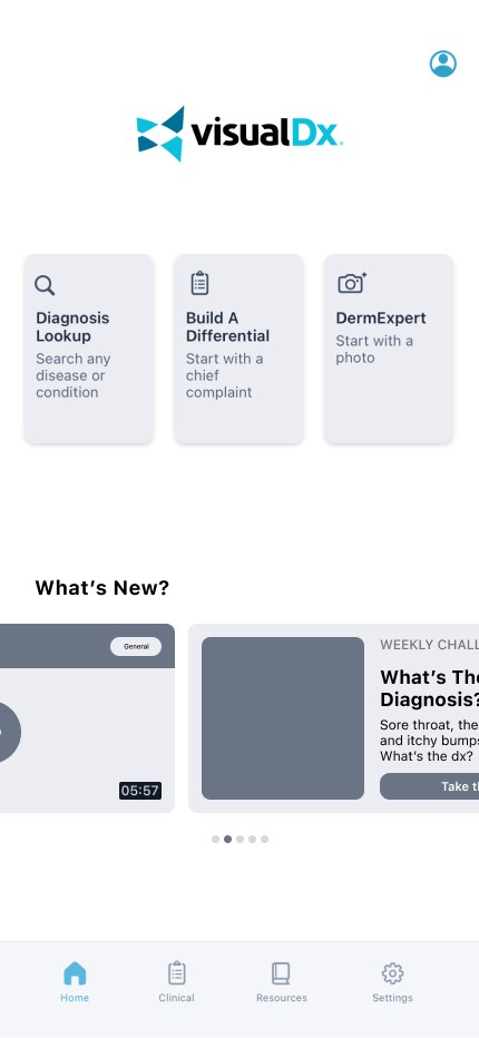
We narrowed global search to Diagnosis Lookup, the action people came for, gave DermExpert more weight, and folded the problem-area grid into a single Build a Differential tool. Then we drew two ways to lay it out.
- Concept A: search first. One prominent Diagnosis Lookup bar, with DermExpert and Build a Differential as smaller cards below it. Fast for anyone who already knows what to type.
- Concept B: three equal doors. Diagnosis Lookup, Build a Differential and DermExpert as three matching cards at the top, each with a one-line description.
Testing with first-time users
I built the whole study in Hubble, from the task flows to every question. It was unmoderated, and every participant was new to VisualDx, so no one was leaning on habits from the old screen.
- Who. Recruited through Hubble’s User Interviews integration and screened for clinicians who deal with skin every day without being dermatologists, such as nurse practitioners and physicians. Non-specialists were the right test: they see skin problems often but need the most help knowing where to start.
- Tasks. Diagnose a rash on a patient’s face, look up poison ivy symptoms, and confirm a suspected case of psoriasis.
- Method. First-click prototypes of both concepts, built to feel like real tasks.
- Measures. Where people tapped first, how confident they felt finishing, and where they hesitated or backtracked.
- Completion. Four of five participants completed every task; the fifth gave one inconclusive response.
- Concept B
- 3 of 5 participants. They liked its organization and the equal weight it gave each tool.
- Concept A
- 2 of 5 participants. They liked its modern look and speed.
The split mattered less than the reasons. People who chose B said it gave them something to hold on to: clear, labeled places to start. People who chose A liked how clean it looked, but the search-first screen gave a newcomer no hint of what else the app could do.
“This is easy to use. I’d go straight to the photo or search.”
Participant, on Concept B
“Looks clean. I feel like I wouldn’t get lost.”
Participant, on Concept A
What shipped
Concept B shipped, with Concept A’s spacing. Diagnosis Lookup, Build a Differential and DermExpert sit at the top as three labeled cards, so a new user knows where to start and a returning one doesn’t have to dig. Below them, a new What’s New carousel made room for medical updates, trending topics and teaching content.
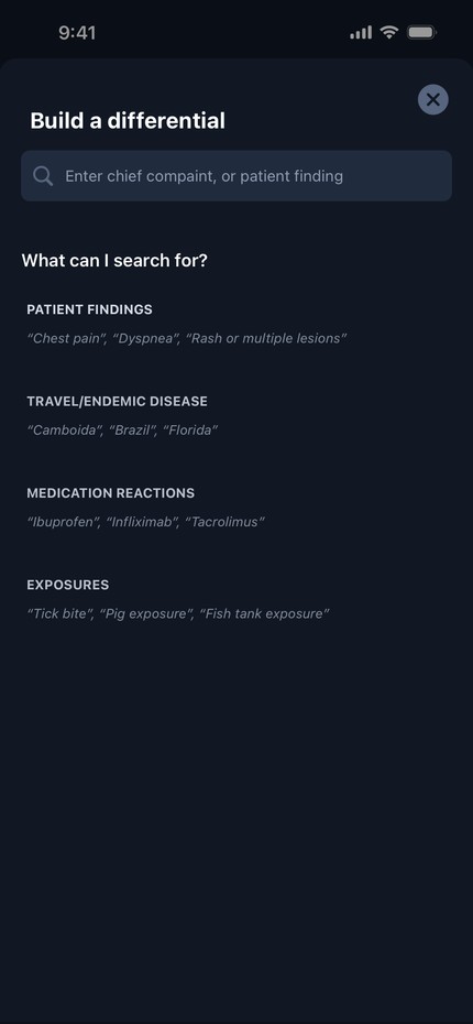
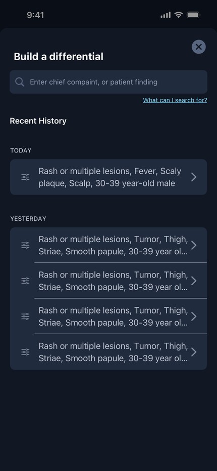
Build a Differential opens as a sheet that explains itself: what you can search for, with examples, and your recent work once you have some.
What I learned
I went in believing the simplest screen, one big search bar, would get people to value fastest. The study changed my mind. New users didn’t need less on the screen. They needed the right few things, clearly labeled.
Next, I’d explore home screens that adapt to the clinician: a dermatologist and an emergency physician arrive with different questions, and the first screen could meet each of them.